Result management
From MedITEX - Wiki
| Line 430: | Line 430: | ||
</tr> | </tr> | ||
<tr> | <tr> | ||
| − | <td colspan="2">The box under<strong> “Show placeholder” / “Show SQL-Query”</strong> is useful for support purposes.</td> | + | <td style="text-align: center;" colspan="2">The box under<strong> “Show placeholder” / “Show SQL-Query”</strong> is useful for support purposes.</td> |
</tr> | </tr> | ||
</tbody> | </tbody> | ||
Revision as of 13:50, 17 December 2012
  |
After a query has been executed the “Report editor: result” window will open.
Contents |
Buttons
Some buttons have special functionalities. Click on it to have more information.
| <img style="display: block; margin-left: auto; margin-right: auto;" src="/images/HomeRE.png" alt="" width="70" height="35" /> | Click this button to go back to MedITEX homepage. |
| <img style="display: block; margin-left: auto; margin-right: auto;" src="/images/RefreshResult.png" alt="" width="85" height="35" /> | If the value related to one or more of the query’s field has been changed, the query’s result can be updated by clicking this button without executing the query once again. |
| <img style="display: block; margin-left: auto; margin-right: auto;" src="/images/UtilizeAs.png" alt="" width="75" height="35" /> | With this button a query can be set as working list in the list section or as standard letter in one of the section of MedITEX. |
| <img style="display: block; margin-left: auto; margin-right: auto;" src="/images/PrintRE.png" alt="" width="86" height="35" /> | With this button may be print the result table or a letter depending on which tab (Query result, Word module or Rich text module) is active. |
| <img style="display: block; margin-left: auto; margin-right: auto;" src="/images/ExportRE.png" alt="" /> | By clicking this button a result table may be exported in different file formats (Excel, CSV, HTML, TXT, PDF and XML). |
| <img src="/images/AdministrateLetters.png" alt="" width="109" height="35" /> | By clicking on this button the window “Configuration” will pop up. |
| <img src="/images/Statistics.png" alt="" width="60" height="38" /> | This button can be used to produce a chart. |
| <img src="/images/Sum.png" alt="" /> | The sum of the values of a column is shown by clicking this button. |
| <img src="/images/Average.png" alt="" width="58" height="35" /> | The average value of the values of a column is shown by clicking this button. |
| <img src="/images/MinRE.png" alt="" width="32" height="35" /> | The minimum value of the values of a column is shown by clicking this button. |
| <img src="/images/MaxRE.png" alt="" width="36" height="35" /> | The maximum value of the values of a column is shown by clicking this button. |
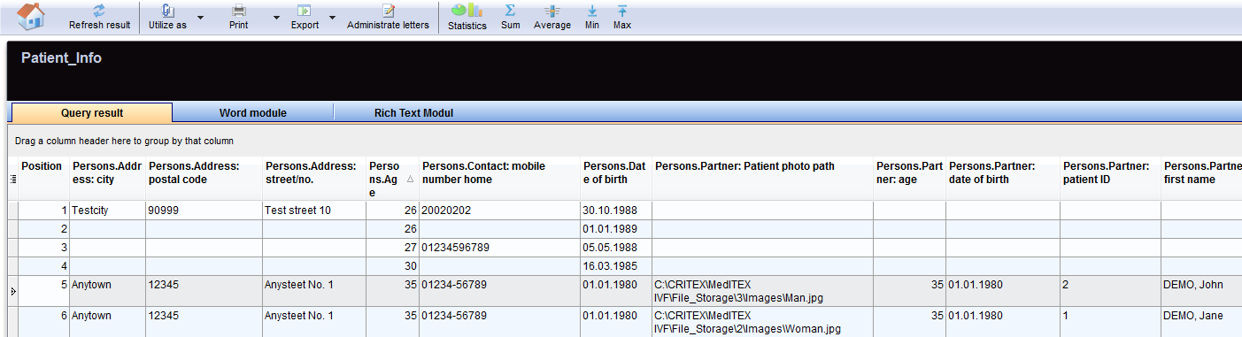
Query results
If the query results tab is selected, all the selected data fields are shown in individual columns. Each raw of the table represents a record.
| |
Filter, group or sort the list of results
The list of results may be filtered, grouped and sorted by clicking the column headers as explained <a href="/index.php?title=Welcome_to_MedITEX_IVF#Managing_Lists">here</a>. The filtering corresponds to a logical restriction of the data sets displayed in the list of results (e. g. only the pregnant patients of all, etc.).
Statistical analysis
The results of the query can be used to carry out a statistical analisys.
There are essentially two way to produce such analisys:
You can apply basal mathematical functions such as sum, average, minimum and maximum to a column or generate a chart.
| <img src="/images/MathRE.png" alt="" /> |
|
Generating a chart
If the <img src="/images/Statistics.png" alt="" width="60" height="38" /> button is clicked the following window will pop up:
| <img src="/images/Chart.png" alt="" width="765" height="625" /> |
For the x-axis of your statistics you can use all columns of the list of results.
For the y-axis you can only use column whose associated field from the data base contains numerical values only (integers, floating-point numbers).
These are only descriptive statistics: histograms, plots and their individual parts.
The interpretation of the y-values exclusively depends on the scale measurement of the data used (the data is, however, displayed in such a way as if the values were all interval-scaled).
| Explaination of the fields/icons: | |
| Curve, Bars... Pareto | These are different layouts that can be chosen for the chart. |
| <img style="display: block; margin-left: auto; margin-right: auto;" src="/images/2D3D.png" alt="" width="59" height="28" /> | By clickng on these icon the chart will have a 2D/3D layout. |
| <img src="/images/0,00.png" alt="" /> |
By clickng on these icon can be set the decimal places. |
| <img src="/images/Epsilon.png" alt="" width="23" height="23" /> <img src="/images/Durchschnitt.png" alt="" width="30" height="26" /> | Switch between summary and average representation. |
| <img src="/images/Colours.png" alt="" width="59" height="25" /> |
Here can be chosen the background colours of the graph and of the form. A third option allow to swap the colours between the graph and the form. |
| <img style="display: block; margin-left: auto; margin-right: auto;" src="/images/Legend.png" alt="" width="57" height="25" /> | Click on this button to show/hide the legend. |
| <img style="display: block; margin-left: auto; margin-right: auto;" src="/images/Toolbar.png" alt="" width="59" height="27" /> | Click on this button to show/hide the toolbar. |
| <img style="display: block; margin-left: auto; margin-right: auto;" src="/images/X.png" alt="" width="28" height="24" /> | Click on this icon to see the distribution of values on X-axis. |
| <img src="/images/Y.png" alt="" width="28" height="24" /> | Click on this icon to see the distribution of values on Y-axis. |
| <img src="/images/VXY.png" alt="" /> | Click on this icon to see the distribution of values of the Y-axis as a function of X-axis categories. |
| <img src="/images/Ed.png" alt="" /> | Click on this icon to edit chat's titles. |
| <img src="/images/ed1.png" alt="" width="24" height="22" /> | Click on this icon to edit font and colour of titles and legend. |
| <img src="/images/ed2.png" alt="" width="24" height="22" /> | Click on this icon to hide/show pattern bar, palette bar and legend. By clicking on this icon it is also possible to access to the data editor. |
| <img src="/images/ed3.png" alt="" width="24" height="22" /> | Click on this icon to modify the view options. |
| <img style="display: block; margin-left: auto; margin-right: auto;" src="/images/Graph.png" alt="" width="85" height="26" /> |
By clicking this button the user can:
|
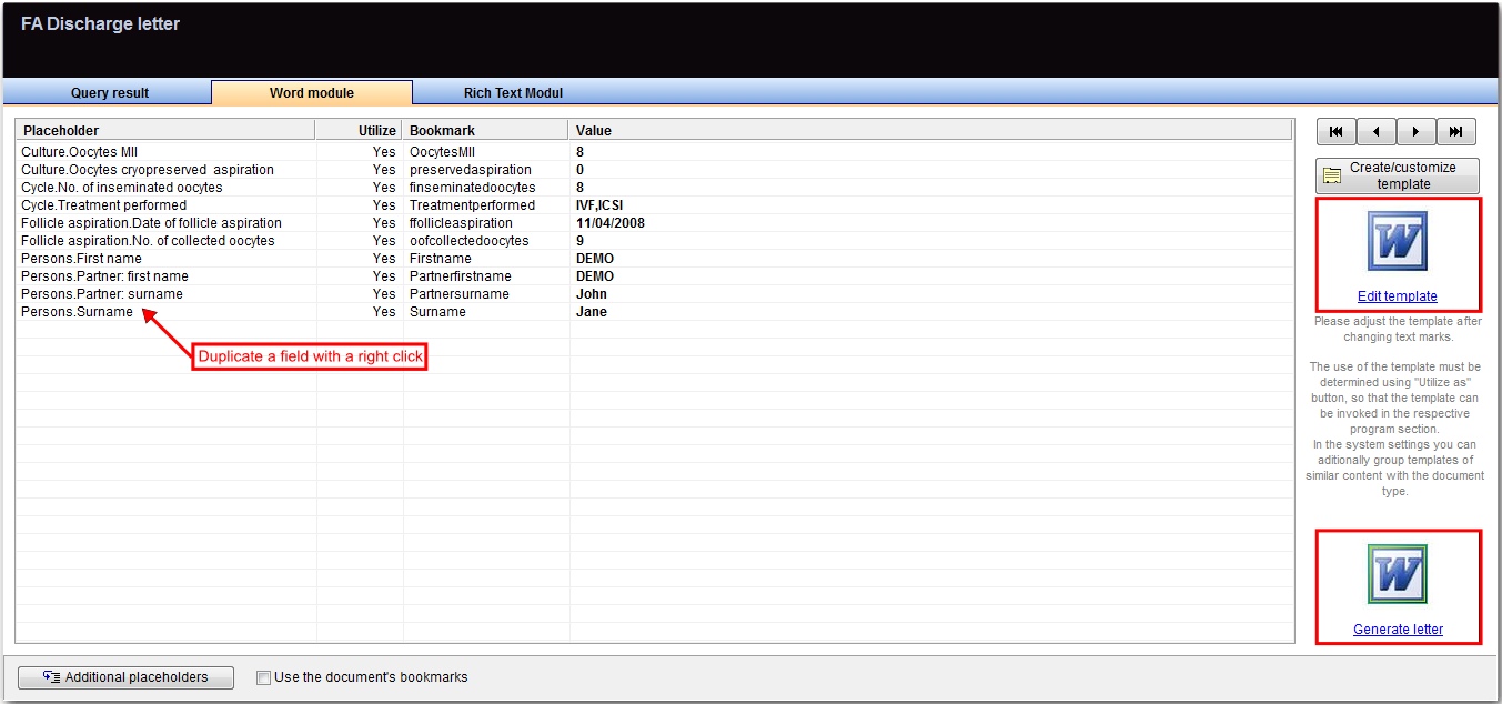
Word module
By selecting the word module tab a simple list will be shown.
  |
Meaning of the columns
| Placeholder |
In this column of the list are shown the placeholders present in the query. Each placeholder has been generated by the selection of one field during the query building. A placeholder can be duplicated just double clicking on it. If the same field is needed more than once in the letter, just duplicate the placeholder. The new placeholder will be filled with the same value of the parent placeholder. |
| Utilize | Here the user can choose if the value related to a placeholder will be shown in the letter. To change the status from Yes to No and vice versa just double click on the corresponding cell. |
| Bookmark | In this column are shown the names of the bookmarks present in the word file related to the query. To edit the name of the bookmark just double click on it. |
| Value |
In this column are shown the results related to a given placeholder for the selected record. |
| <img src="/images/REButtons.png" alt="" /> |
With these buttons it is possible to swap back and forward from a record to another changing accordingly the values of the results. |
| <img src="/images/AdPlace.png" alt="" width="200" height="25" /> |
Using additional placeholders: In addition to the placeholders selected while building the query, additional placeholder can be used. The additional placeholders allow the user to add to the letter: ultrasound and embryo images, user signatures, date and time specifications. To add a placeholder just press this button . When a placeholder is selected it will appear in the list along with its bookmark and it can be used in the letter just like other placeholders. |
| <img src="/images/UseBook.png" alt="" width="200" height="26" /> |
Creating a letter
When the query is saved for the first time, a word record is created in the folder WOMOD. This folder is in File_Storage\Templates. The complete path can be seen in the settings.
| <img style="display: block; margin-left: auto; margin-right: auto;" src="/images/CreateCust.png" alt="" /> |
When this button is clicked the standard WOMOD template opens. The template will contains all the bookmarks listed in the Bookmarks column with the related placeholder. |
|
If a model of the letter is available as MS word document, it is possible to save such model as template before building the query. The template must be saved in the WOMOD folder and shall have the same name that the query will have. |
|
To create a letter:
  |
| 1. Write down the standard text. |
  |
  |
|
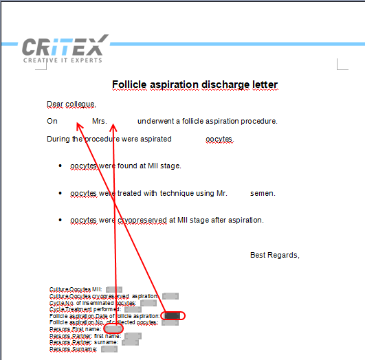
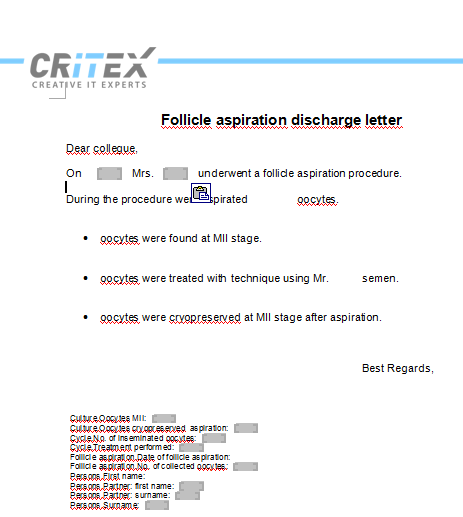
2. Cut and paste the bookmarks in the appropriate place. Once a bookmark is placed, the related placeholder can be deleted. |
|
  |
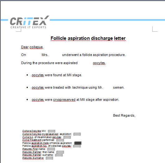
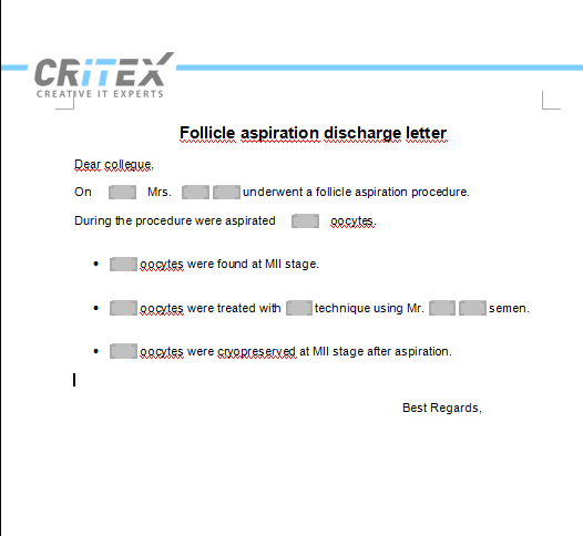
| 3. When all the bookmarks are placed and placeholder are deleted the letter can be saved. |
| <img src="/images/ed4.png" alt="" width="147" height="102" /> | This saved letter may be edited by clicking "Edit template". |
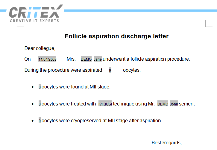
| <img src="/images/ed5.png" alt="" /> | To visualize and print the letter related to the selected record just press "Generate letter" the letter with all the filled bookmarks will open: |
  |
|
Using the letter as standard letter template
Once the letter is created you may want to let it available as standard template.
What matters here is the combination of the group elements for your query.
|
If your query contains a reference to |
|
|
you can utilize the document as a cycle letter. you can utilize the document as an insemination letter. you can utilize the document as a medical history letter. you can utilize the document as a lab letter. you can utilize the document as a semen analysis letter. you can utilize the document as a administration letter. you can utilize the document as a letter for referring doctors. |
Press the black arrow on the right of the button "Utilize as", select the entry "Letter templates" and assign the document to one of the available entries.
In the case of our FA letter will be available only two options:
| <img src="/images/Letter6.png" alt="" /> |
In the main window of MedITEX IVF you can now click the menu-item “Letters” and see (depending on the currently opened input mask) exactly those queries whose letter templates you have linked (assume we have chosen for our query “Cycle letter”, the letter will be available in the cycle input mask).
A click on the desired entry in the menu leads to the execution of the query for the current patient or the current therapy only.
A word document is then generated from the associated letter template. The word document will automatically be copied in the file storage folder related to the patient and the document entry in the patient’s demographics mask will also be generated. The type of the document generated in the demographics will be the one assigned as described <a href="#Administrate">here</a>.
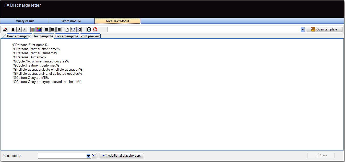
Richt text module
The rich test module tool allow to compose rapidly letters and documents. A document is generally made up of three areas: header, text area and footer.
  |
- In the header, for example, you can add a logo, individual text and the date.
- In the text area you can add individual text which ideally contains placeholders (text contained between two %%; eg %Persons.First name%) of the result table. As you can see in the print preview, these placeholders will be replaced by the values of the result table. Placeholders can be duplicated selecting them from the drop box “Placeholders” and clicking on <img src="/images/RichB.png" alt="" width="26" height="23" />. Moreover additional placeholders can be used. Learn more about this tool <a href="#placeholder">here</a>.
- In the footer you can enter salutation and center name.
Standard formatting (font size, text alignment, color etc.) can be applied in all three areas.
Header and footer can be saved and imported later for other documents.
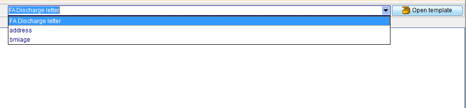
| <img src="/images/OpenTemp.png" alt="" width="143" height="21" /> | To import header and footer from another document, select the document to import from and press "Open template". |
  |
|
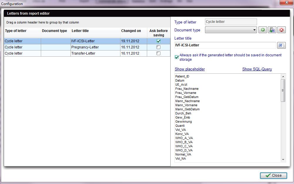
Administrate letters
When the button <img src="/images/AdministrateLetters.png" alt="" width="109" height="35" /><a href="#Administrate"></a> is clicked the following window opens:
  |
The list on the left shows the letters which have been set to be available in one of the MedITEX’ section. If the user selects the type of document in the “Document type” drop menu, the letter will be saved in the demographic section among the documents of the same type.
| <img style="display: block; margin-left: auto; margin-right: auto;" src="/images/AdEdDelRE.png" alt="" width="97" height="30" /> |
Other types of documents may be created clicking on "Plus" or by means of the related system table. Once a type of document is created it will be available in the "New entry" menu present in the Demographics section. With the button "Edit" the document type can be edited. A letter can be removed from the MedITEX section it was assigned by selecting it and clicking on "Delete". |
| <img src="/images/Always.png" alt="" width="350" height="37" /> | Enabling memory query. |
| The box under “Show placeholder” / “Show SQL-Query” is useful for support purposes. | |
| <a href="/index.php?title=MedITEX_IVF_manual">Back to the MedITEX IVF menu </a> | <a href="#top">Back to top</a> |