Cycle summary
From MedITEX - Wiki
| Line 112: | Line 112: | ||
<h2>Cycle</h2> | <h2>Cycle</h2> | ||
<p>You can chance which cycle is being displayed in the summary by clicking on the menu item <strong>Cycle</strong>.</p> | <p>You can chance which cycle is being displayed in the summary by clicking on the menu item <strong>Cycle</strong>.</p> | ||
| − | <p> | + | <p>The cycle currently being displayed has <strong>bold</strong> letters.</p> |
| + | <table style="margin-left: auto; margin-right: auto;" border="0"> | ||
| + | <tbody> | ||
| + | <tr> | ||
| + | <td colspan="2" rowspan="2"><img style="display: block; margin-left: auto; margin-right: auto;" src="/images/CS18.png" alt="" width="455" height="404" /></td> | ||
| + | </tr> | ||
| + | </tbody> | ||
| + | </table> | ||
| + | <table style="float: right;" border="0"> | ||
| + | <tbody> | ||
| + | <tr> | ||
| + | <td style="text-align: right;"><a href="/index.php?title=MedITEX_IVF_manual">Back to the MedITEX IVF menu </a></td> | ||
| + | <td style="text-align: right;"><a href="#top">Back to top</a></td> | ||
| + | </tr> | ||
| + | </tbody> | ||
| + | </table> | ||
Revision as of 15:04, 12 December 2012
  |
Cycle Summary brings in a single place, all information related to patient's cycles. It is a tool designed for easily generating a comlete overview of a particular treatment.
One of the key features of Cycle Summary is its customization. The layout of the information being displayed can be completely rearranged to your needs.
Contents |
Buttons
| <img style="display: block; margin-left: auto; margin-right: auto;" src="/images/CS2.png" alt="" width="16" height="16" /> | Collapse: hides de content being displayed. |
| <img style="display: block; margin-left: auto; margin-right: auto;" src="/images/CS3.png" alt="" /> | Expand: shows the content that was hidden. |
Customize layout
The customization interface can be accessed in the menu under Layout -> Customize layout.
| <img style="display: block; margin-left: auto; margin-right: auto;" src="/images/CS4.png" alt="" width="292" height="256" /> |
This is the customization interface. The Layout Tree View displays all current items in the summary and Available Items contains all items not being used.
| <img style="display: block; margin-left: auto; margin-right: auto;" src="/images/CS5.png" alt="" width="477" height="511" /> |
Clicking on Tabbed View (marked on the image above), changes the Customize window to display two separate tabs.
| <img style="display: block; margin-left: auto; margin-right: auto;" src="/images/CS6.png" alt="" width="477" height="511" /> |
Buttons
| <img style="display: block; margin-left: auto; margin-right: auto;" src="/images/CS7.png" alt="" width="15" height="13" /> | Undo: undoes the last procedure. |
| <img style="display: block; margin-left: auto; margin-right: auto;" src="/images/CS8.png" alt="" width="15" height="13" /> | Redo: redoes the last procedure. |
| <img style="display: block; margin-left: auto; margin-right: auto;" src="/images/CS9.png" alt="" width="16" height="16" /> | Store Layout: saves the layout after it has been customized. |
| <img style="display: block; margin-left: auto; margin-right: auto;" src="/images/CS10.png" alt="" width="16" height="16" /> | Restore Layout: after saving the layout, clicking on this button will restore it to the previous state. |
| <img style="display: block; margin-left: auto; margin-right: auto;" src="/images/CS12.png" alt="" width="16" height="16" /> | Collapse All: hides the the hierarquy of the tree. |
| <img style="display: block; margin-left: auto; margin-right: auto;" src="/images/CS11.png" alt="" width="16" height="16" /> | Expand All: shows the hierarquy of the tree. |
| <img style="display: block; margin-left: auto; margin-right: auto;" src="/images/CS13.png" alt="" width="16" height="16" /> | Delete: this button is only active if you create a new group or auxiliary item. It deletes these newly created groups/items. |
| <img style="display: block; margin-left: auto; margin-right: auto;" src="/images/CS15.png" alt="" width="16" height="16" /> | Add Group: adds a new group. The use of this functionality is not advisible. Instead, use the already available groups. |
| <img style="display: block; margin-left: auto; margin-right: auto;" src="/images/CS14.png" alt="" width="16" height="16" /> | Add Auxiliary Item: adds a new auxiliary item. The use of this functionality is not advisible. Instead, use the already available items. |
| <img style="display: block; margin-left: auto; margin-right: auto;" src="/images/CS16.png" alt="" width="23" height="20" /> | View as Tree / Plain List: changes the layout of the Available Items. |
Printing
Printing is accessable on the menu under Print. Here, we have an option to configure the page, preview and the actual printing command.
| <img style="display: block; margin-left: auto; margin-right: auto;" src="/images/CS17.png" alt="" width="477" height="289" /> |
Cycle
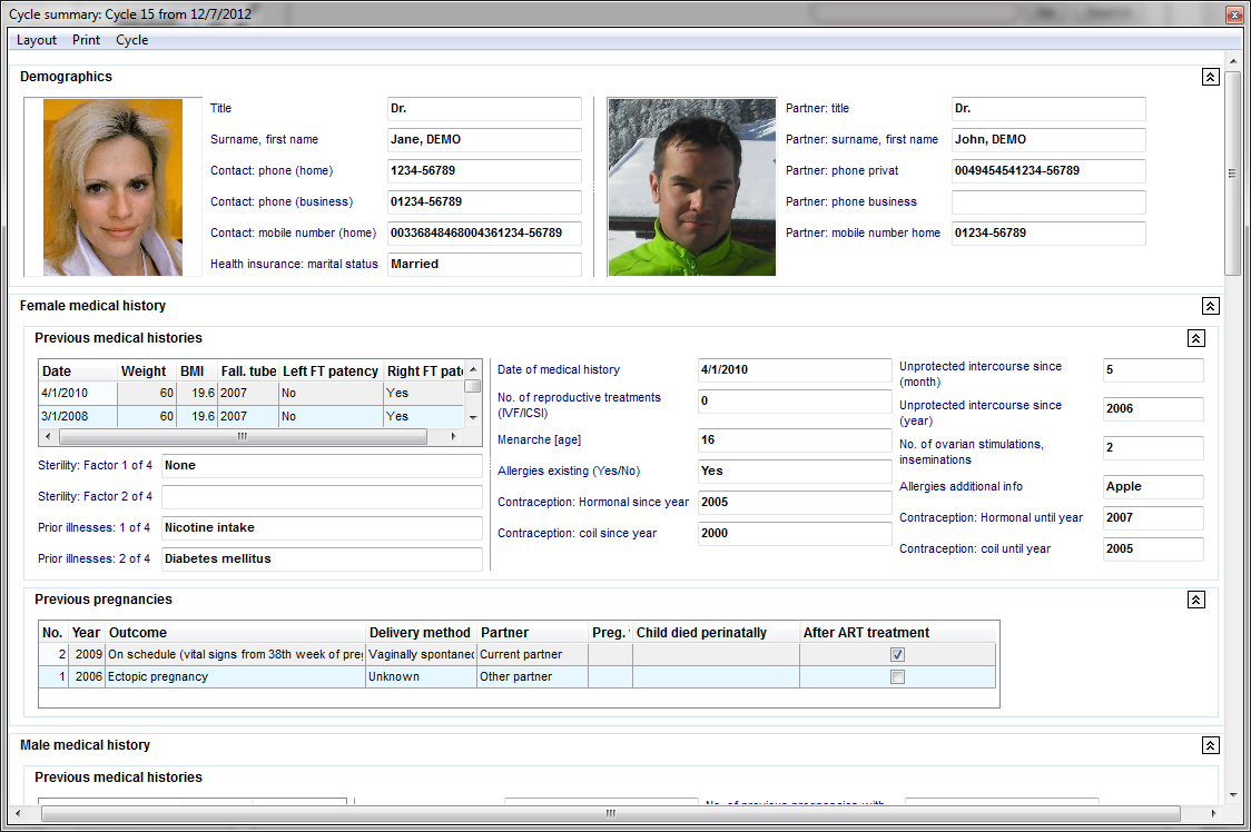
You can chance which cycle is being displayed in the summary by clicking on the menu item Cycle.
The cycle currently being displayed has bold letters.
| <img style="display: block; margin-left: auto; margin-right: auto;" src="/images/CS18.png" alt="" width="455" height="404" /> |
| <a href="/index.php?title=MedITEX_IVF_manual">Back to the MedITEX IVF menu </a> | <a href="#top">Back to top</a> |